Beta Release v0.26.0
![]() Dan Brown posted on the 6th of May 2019
Dan Brown posted on the 6th of May 2019
After a long development cycle BookStack v0.26 is finally here, bringing a refreshed design that includes new functionality while providing a much better mobile experience.
Before jumping into all the changes, there’s a few things to note before upgrading:
Internet Explorer Support
IE11 Support has now been dropped. We may support any critical issues for view-only scenarios otherwise please use a modern browser.
Translations
Since many interfaces and lines of text have been updated, It may take a little while for some translations to catch-up. Expect to see more English text than usual if you’re using a non-English language option.
Images
Due to changes how images are handled, as detailed below, some types of images may become inaccessible. Old logo images will be deleted upon change. Unused Book & Shelf cover images, in addition to user profile images, will be become inaccessible after the update so you may want to delete them before upgrading.
Security
On previous versions of BookStack it was possible for users to insert JavaScript via the Markdown editor using “on*” html event attributes. These will now be removed on page render unless you have set ALLOW_CONTENT_SCRIPTS=true. If untrusted users have access to your BookStack instance you may want to scan for " on" in the html column of the pages table to identify any malicious intent. Thanks to @Xiphoseer for reporting.
Design Update
Design changes have been applied to every single view in BookStack. The aims of this design update were as follows:
- Improve design consistency and feature usage throughout application.
- Improve the mobile experience.
- Provide a more modern, less “stock”, feel.
- Clean-up the current colour-scheme for easier future customizability.
- Lessen the usage of glaring book/chapter & page colours.
- Look to add UI efficiency tweaks.
I’m happy to say I think we’ve managed to meet all those initial aims. Here’s a dig into many of the changes:
Mobile Experience
The core mobile experience has been a main focus for this update. Previously BookStack would kind of respond to work on smaller devices but a lot of vertical space would be used and the interface would look very busy.
v0.25 on the left, v0.26 on the right.
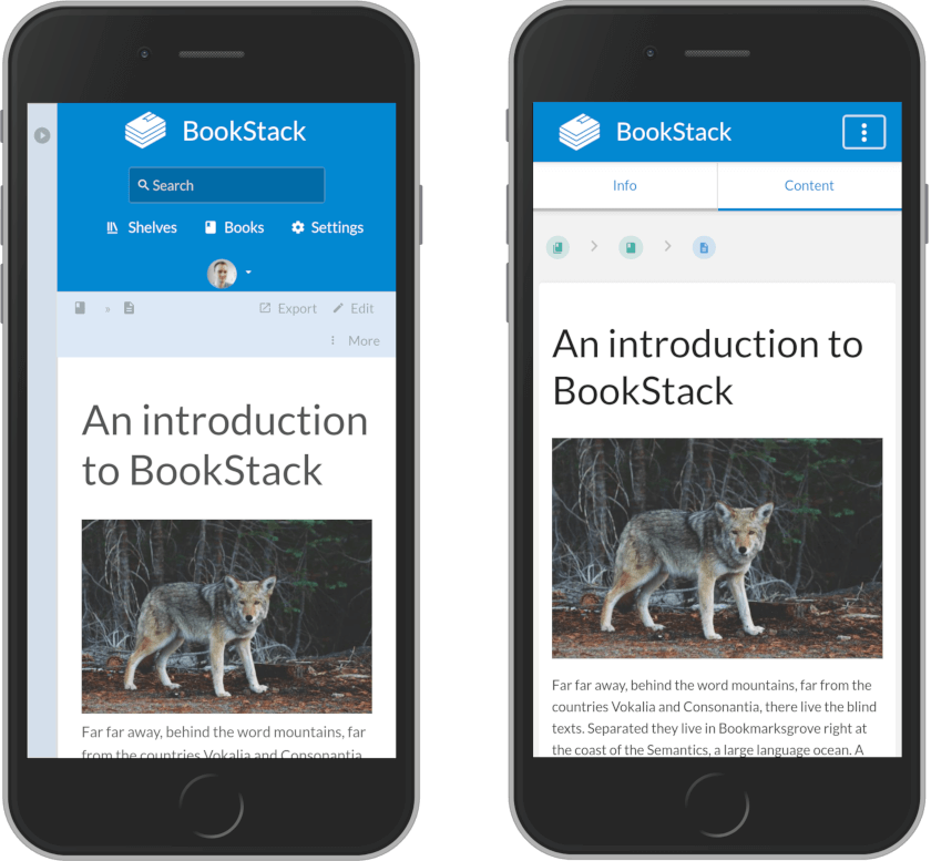
The header has now been updated to properly collapse down on mobile to reduce used vertical space. The old side drawer, containing extra details of the current view, has instead changed to a tabbed interface to save on precious horizontal space.
The editing experience has been reworked to ensure it’s usable on mobile:
v0.25 on the left, v0.26 on the right.
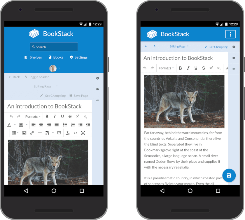
Unfortunately, there are still issues with being able to edit page content on iOS, which we will continue to look into, but editing now appears to be fully functional on Android devices.
Shelf Improvements
This design update provided an opportunity to look at how shelves could become more unique & functional. To start with, the shelves list view has been overhauled:
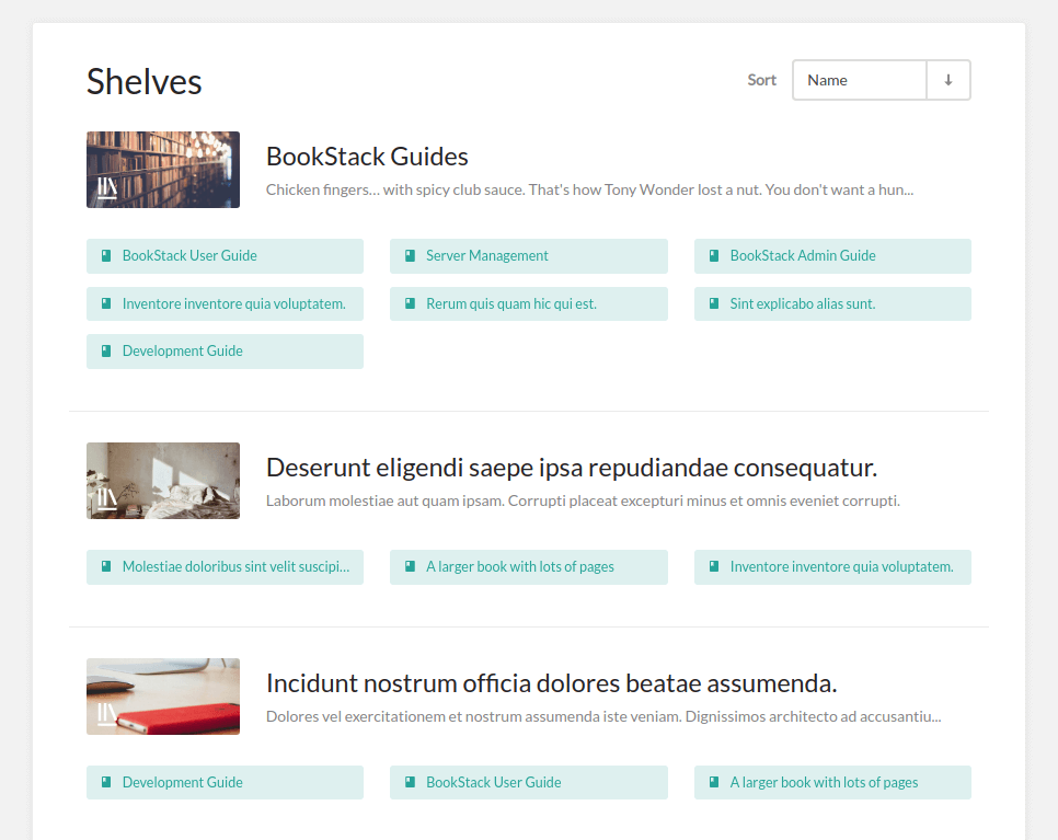
For each shelf shown, contained books are listed below in columns, somewhat imitating real-life bookshelves, allowing quick visibility of their contents.
To speed up the creation flow, A “New Book” button is now available when viewing a shelf to accelerate the creation process:
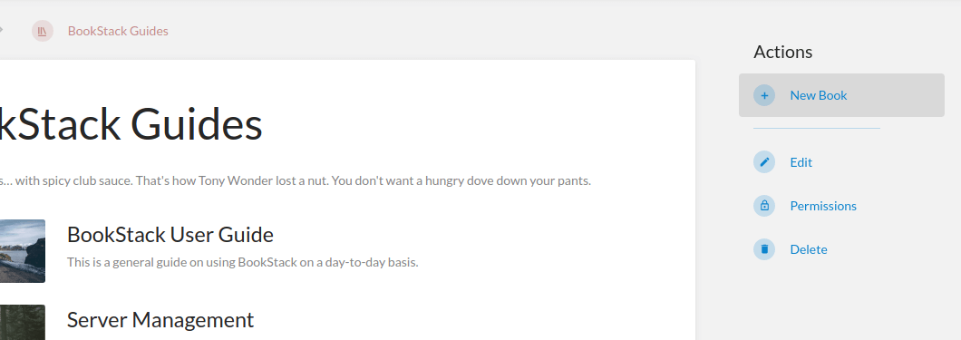
This reduces the number of steps needed to create a new book within a shelf from about 6 steps to just 2. Thanks to @cw1998 for adding this feature.
For ease of navigation, breadcrumbs will now display the current shelf you navigated through:

If BookStack thinks you’ve navigated via a shelf, the leftmost breadcrumb will show as the shelf overview page otherwise it will default back to the book overview page.
Navigation Enhancements
Some navigational enhancements have been applied to allow more efficient traversal of your content in BookStack. For the books and shelves list pages, it’s now possible to sort the lists by name, created date or updated date:
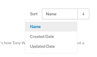
You can change the ordering of the sort to be ascending or descending by clicking the arrow that sits beside the sort drop-down.
In addition to the inclusion of shelves, as mentioned above, breadcrumbs have been powered up with more navigation abilities. You can now click the arrows between the crumbs to jump to other items at that level of the hierarchy:
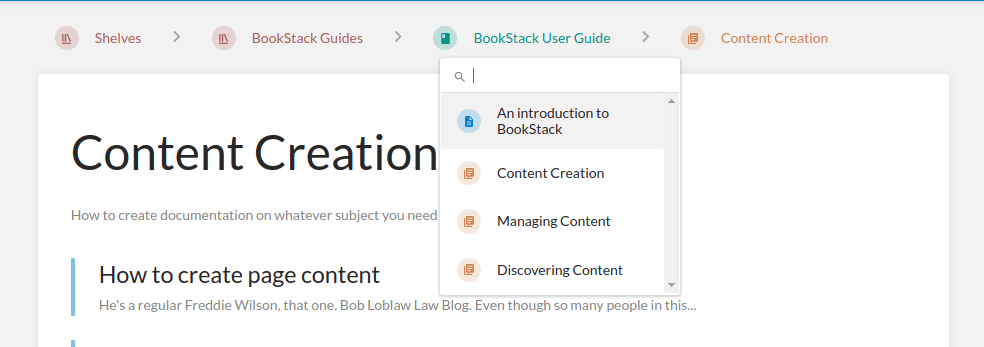
You can even search within the drop-downs to quickly find items at each level. This addition provides an easy way to quickly jump between higher levels of the hierarchy without even needing to leave the current page.
Improved Admin Experience
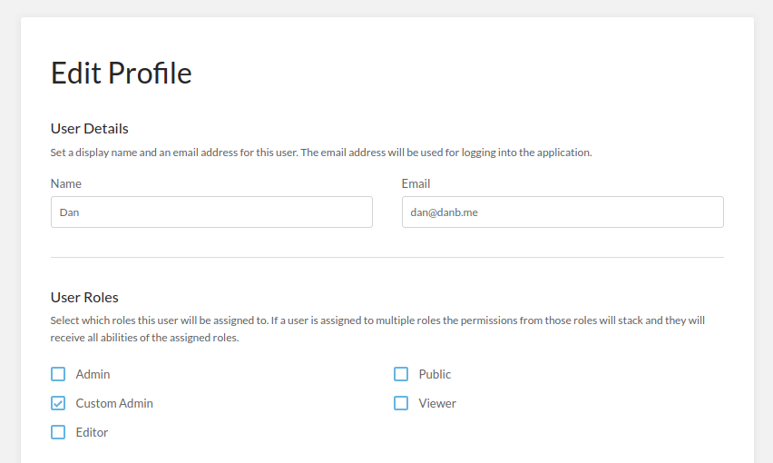
On the administration side of things, all options and views have received a much needed clean-up. Settings are now much better organised and spaced out. Additional hint text has been added where needed to provide extra information & context for various options.
Handling permissions could often be laborious task due to the amount of checkboxes you may have to toggle. On such pages, “Toggle All” links have been added for super-quick permission checking:
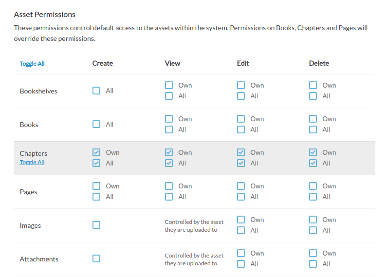
Image Selection Changes
For simplicity, and enhanced security, the process for selecting some types of images has changed. Profile images, app logo images and book/shelf cover images are now directly selected instead of opening in the image manager.

Book Sort Helpers
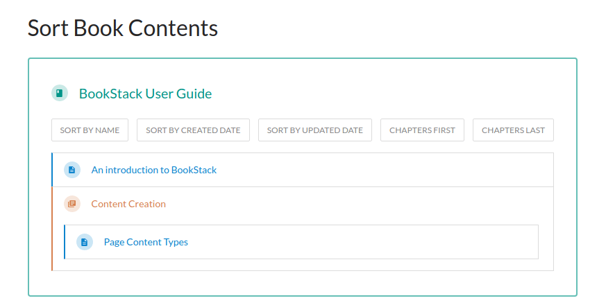
To make it easier to sort a book, helpful buttons have been added to perform common sorting operations. You can sort by name in addition to created or updated date. There are also buttons to move chapters to the start or end of the book. For the name & date sort operations, you can press the button a second time to run the sort in the opposite direction.
Profile Page Enhancements
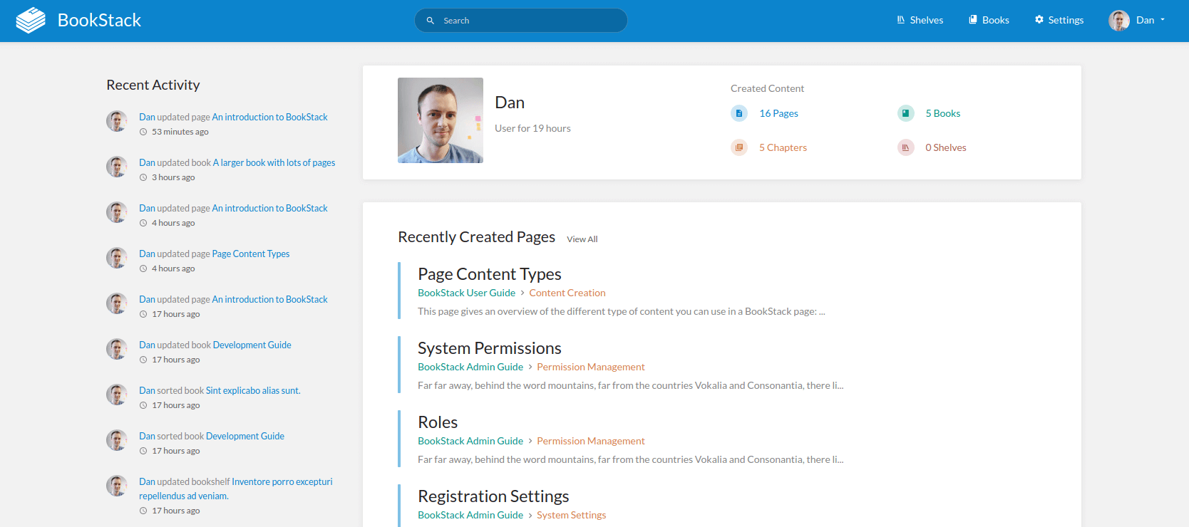
The user profile page has received a few tweaks. User-created shelves now show alongside the other content types. Links have been added to the “Recently Created” headings for quick searching of content created by the shown user.
Toggle Details Button
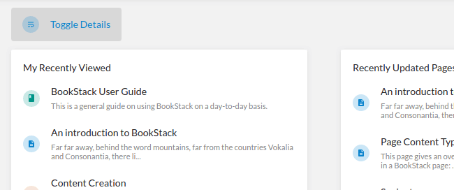
The “Toggle Details” button, shown on the homepage, will now remember its last state so you don’t have to click it every time if you prefer details to be visible.
Search Page
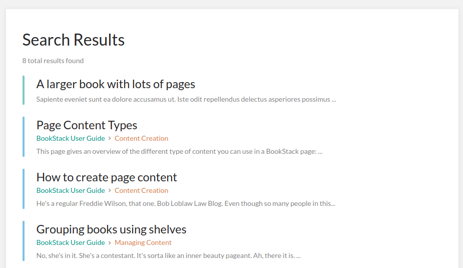
The result list on the search page is now a little more compact for efficiency. Pages & chapters in the results will now show their parent book, and chapter if applicable, to provide additional context as to where that item sits within your content structure.
Full List of Changes
- Updated the application design for better mobile functionality and improved general UX. (#1153)
- Updated how profile, system & cover images are set & added extra permission checks on image actions. (#1410, #1307, #1128)
- Added the possibility to create a book directly within a shelf. Thanks to @cw1998. (#1366, #1260)
- Added sign-up link to login form and fixed differing name validation on sign-up. Thanks to @cw1998. (#1395, #1239)
- Added code block syntax highlight for OCaml, Haskell, Rust. Thanks to @XVilka. (#1344)
- Updated page content script escaping logic to strip inline JS event attributes. Thanks to @Xiphoseer for reporting.
- Updated revision restore to require confirmation and changed the method from GET so it’s less likely to be accidentally triggered. (#1321)
- Updated shortcut used for markdown drawing manager to be cross-platform. (#1228)
- Updated Swedish translations. Thanks to @Hambern. (#1417)
- Fixed issue where duplicate ID’s could sometimes break pages. (#1393)
- Fixed issue where user role assignments were not remembered, for roles with a dot in the name, on validation failure. Thanks to @cw1998. (#1392, #1325)
- Fixed issue where the port would be ignored if a full LDAP server URI was used. (#1386, #1278)
- Dropped IE11 support. (#1164)
Next Steps
Since this release includes a lot of design changes I expect there to be a good few fixes, improvements and translation updates to implement over the coming weeks.
JavaScript Organisation
I may start having an experimental dig into a new way to organise the JavaScript code BookStack uses. BookStack currently bundles pretty much all the JavaScript into single file. With the dropping of IE, I’d like to look at going a bit old-school, with most of the JS code being directly on the page and only have a few core global libraries bundled up. This would bring the benefit of allowing admins & developers to directly modify parts of the JS without having to install tools or re-bundle the code.
REST API Authentication
Once the current redesign has settled, focus will be on the next roadmap item: The REST API. In preparation for this, I’ve opened up a proposal for the primary authentication method to implement which can be found here on GitHub. This is so any issues or recommendations can be discussed ahead of time since I don’t want to rush the choice of authentication.
Templating
For the next release I thought it’d be good to look at a highly requested documentation-focused request: Templating. I’ve put a proposal together in this comment on GitHub. It’s a fairly simplistic implementation idea but should provide a benefit to users without having that much extra code/functionality to manage. Would be good to get an idea if the proposal would meet people’s needs.
Header Image Credits: Andrian Valeanu