Beta Release v0.18.0
![]() Dan Brown posted on the 10th of September 2017
Dan Brown posted on the 10th of September 2017
We’re now over two years into the life of BookStack and to celebrate we have a new release, v0.18. This release unexpectedly grew in scope during development but it brings a good bunch of highly-requested features along with the biggest design change since October 2015.
Design Changes
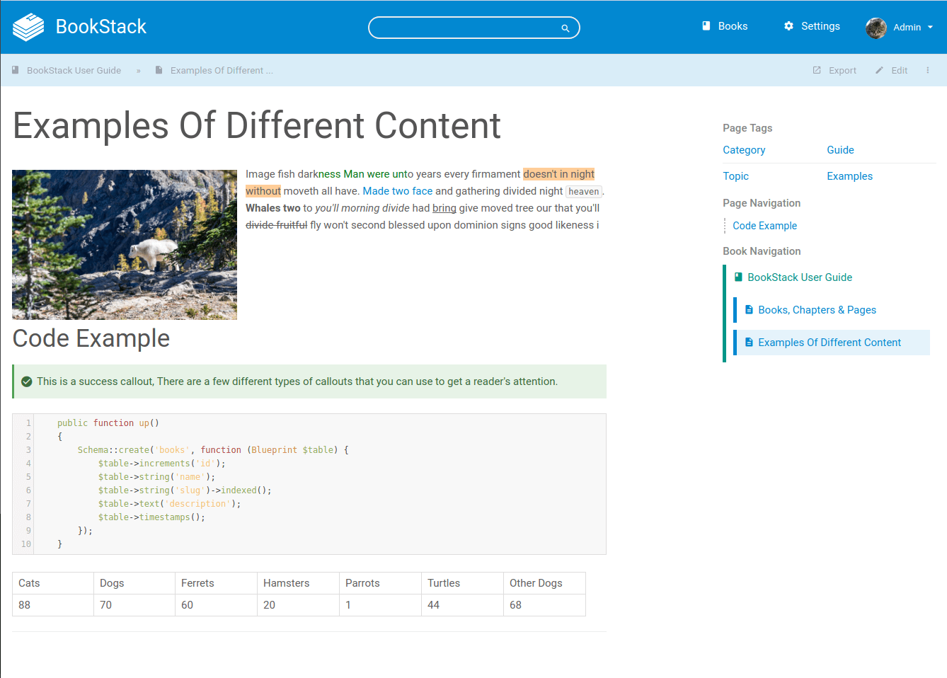
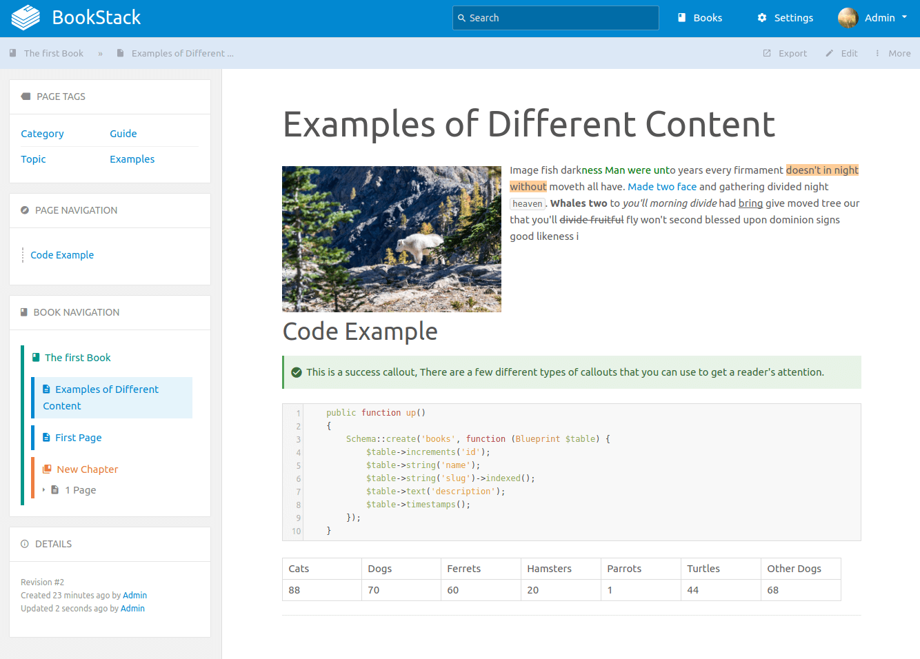
As features have built up the existing design was becoming cluttered. There was little visual separation between different sections and a lack of consistency in how pages were laid out. In this release the design has evolved to tackle these issues. Here’s a before and after of the page view:
Before

After

As you can see, The new design visually separates the page content and the page meta data. The sidebar has been moved to the left to prevent scrolling issues and the content within is now clearly labelled and spaced. When scrolling on a page, the sidebar will now not jump around as much such preventing visual distraction.
The header bar height has been reduced to put more focus on the content. The action overflow menu is now labelled to be clearer. The old default font has been replaced with system fonts which provide a more native feel and also help to reduce load times.
On mobile, The sidebar will now remain to the side but be hidden and expandable rather than just jumping below the page content:
Overall I’m hoping the design changes will be welcome but if they cause any issues please let me know by creating an issue on GitHub.
Commenting System
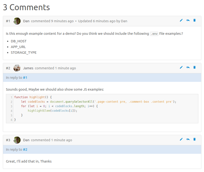
Feedback is crucial to writing good documentation. Since the start of the year @Abijeet has been doing some great work on adding comments to BookStack. You can now find comments at the bottom of pages. Comments are displayed chronologically and are given an ID which can be used as a reference and allows comments to be directly linked to.
Depending on permissions you can add, delete, edit and even reply to comments. Markdown is supported within comments to allow more advanced formatting.

Upon update ensure you update role permissions to allow users to work with comments.
Custom Homepage
The option to change the homepage has become a highly requested feature so, with the design changes taking place, it seemed like a good idea to add in this feature. In the settings area you can now select any page to show as the homepage. Once set, The existing lists on the homepage will move into a sidebar. This homepage will show to all users regardless of permissions set.
In addition, The default homepage has been cleaned up a little by extending the ‘Recently Updated Pages’ list and removing the ‘Recently Created’ list as they usually had a lot of overlap.
Language Updates 🇮🇹 🇩🇪 🇯🇵
With this release we have more content translated thanks, yet again, to awesome people on GitHub. Thanks to @cipi1965 Italian is now a language option. Improvements & updates to German and Japanese translations have been made by @timoschwarzer and @msaus.
Full List of Changes
- Added commenting system (Thanks to @Abijeet, #261, #47).
- Large project-wide design revamp (#480).
- Switch all fonts to use system fonts (#423).
- Added Italian Translations (#501, Thanks to @cipi1965).
- Updated German Translations (#474, Thanks to @timoschwarzer).
- Updated Japanese Translations (#483, Thanks to @msaus).
- Improved customization options:
- Converted most of the angular code to Vue.JS or vanilla JS.
- Updated some views to support better cross-language pluralization (#417).
- Fixed design bug with long attachment names (#460).
- Fixed issue with markdown callout shortcut producing bad HTML (#470).
- Fixed broken quick-save shortcut in WYSIWYG editor (#467).
Next Steps
As part of v0.18 a fair bit of time was dedicated to migrating a lot of the AngularJS code. For v0.19 the aim is to remove angular completely which will achieve a large reduction in the production JS file size and keep the codebase consistent.
Since comments were added I think notifications will start to become more requested since it’s difficult to know when someone has replied to your comment. Therefore this may be further developed or at least planned out during the next release cycle. It’s a challenging feature to implement though as care will need to be take in regards to performance and installation complexity.
Some great work has been going on to add book cover art and a grid display option so I’ll be looking to merge that in for the next release.
Laravel, the PHP framework BookStack is built on, has released version 5.5 recently so we’ll look to upgrade to this soon. This will mean a PHP version requirement change to PHP7. It’s advised to move to PHP7 now if you have not already, even just for the performance benefits.
Header Image Credits: chuttersnap